
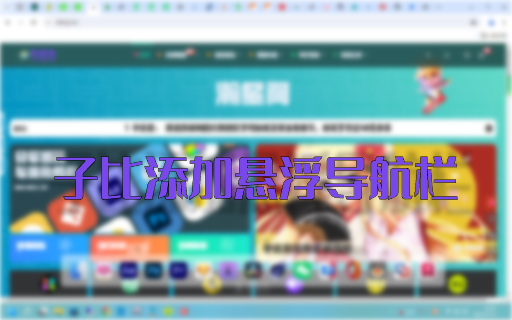
![图片[1]-子比主题添加一个悬浮伸缩侧边栏-瀚星阁](https://anxkj1.s3.bitiful.net/hxing/wztp/home.jpg)
js代码(用于aplayer加载)
audio需要在里面添加歌曲,首页才能正常播放
wordpress无法支持meting的播放器,所以这边使用了aplayer作为音乐播放器
使用lrcType: 3作为歌词显示
          const ap = new APlayer({
              container: document.getElementById('aplayer'),
              fixed: true,
              order: 'random',
              preload: 'none',
              volume: 0.25,
              lrcType: 3,
              audio: [
                {
                name: '不眠之夜:星穹铁道',
                artist: '张杰/MOYO-Mix',
                url: 'https://cn-sy1.rains3.com/anxkj.fun/music/%E5%BC%A0%E6%9D%B0%20_%20HOYO-MiX%20-%20%E4%B8%8D%E7%9C%A0%E4%B9%8B%E5%A4%9C.ogg',
                lrc: '/music/lrc/1.lrc',
                cover: 'https://y.qq.com/music/photo_new/T002R300x300M000004ItRwk3R0LYz_1.jpg?max_age=2592000'
                }
              ]
            });
html代码
悬浮伸缩侧边栏的html(轻笑Chuckle的教程里面的主题是hexo butterfly,主题语言是pug格式,这边用到的代码是pug转换为html)
里面的东西可以试着修改一下
<div class="contact-info">
	<div class="option" id="anything">
		<i class="fa fa-bell-o"></i>
		</i>
		<div class="bloktop">
		</div>
		<div class="text">
			安凝雪科技欢迎您!
			<div class="strip">
			</div>
			<div class="something">
			</div>
		</div>
	</div>
	<div class="option">
	<i class="fa fa-windows">
	</i>
	<div class="blok">
	</div>
	<div class="text">
		<div class="strip">
		</div>
		<div class="post-reward">
			<button class="tip-button reward-button">
				<span class="tip-button__text">
					投喂
				</span>
				<div class="reward-main">
					<ul class="reward-all">
						<li class="reward-item">
							<a class="about-reward" href="https://pay-vmq.wyblog1.tk/enQrcode?url=https://pay.what2018.com/paypage/?merchant=1aaa9Mgm1K11GNnbE58DnZd%205F5t8uh/o20EhUX1Szl0" target="_blank">
								<img class="post-qr-code-img" src="https://pay-vmq.wyblog1.tk/enQrcode?url=https://pay.what2018.com/paypage/?merchant=1aaa9Mgm1K11GNnbE58DnZd%205F5t8uh/o20EhUX1Szl0"
								data-lazy-src="https://pay-vmq.wyblog1.tk/enQrcode?url=https://pay.what2018.com/paypage/?merchant=1aaa9Mgm1K11GNnbE58DnZd%205F5t8uh/o20EhUX1Szl0" loading="lazy"
								alt="微信">
							</a>
							<div class="post-qr-code-desc">
								微信
							</div>
						</li>
						<li class="reward-item">
							<a class="about-reward" href="/img/alipay.webp" target="_blank">
								<img class="post-qr-code-img" src="data:image/gif;base64,R0lGODlhAQABAIAAAAAAAP///yH5BAEAAAAALAAAAAABAAEAAAIBRAA7"
								data-lazy-src="https://cdn.qcqx.cn/blog/pay/alipay.webp" loading="lazy"
								alt="支付宝">
							</a>
							<div class="post-qr-code-desc">
								支付宝
							</div>
						</li>
					</ul>
				</div>
			</button>
		</div>
	</div>
  </div>
	<div class="option">
		<i class="fa fa-music">
    </i>
    <div class="blokbottom"></div>
    <div class="text aplayertext">
    	<div class="strip"></div>
      	<div id="aplayer">
			</div>
		</div>
	</div>
</div>
</div>
</div>
CSS代码
侧边栏css代码
css代码还未写完,播放器样式功能可能跟轻笑的不一样
比轻笑Chuckle提供的css多一些(用轻笑Chuckle提供的css会出现赞赏无法正常使用)
.contact-info{
    position: fixed;
    top: 22%;
    z-index: 200;
    left: -51px;
    transition: 0.4s;
  }
  .contact-info:hover{
    left: 0px;
  }
  .contact-info .option{
    cursor: pointer;
    position: relative;
  }

  .contact-info .option i{
    display: block;
    width: 50px;
    text-align: center;
    height: 60px;
    line-height: 60px;
    background: rgb(255, 255, 255);
    color: #b9b9b9;
    font-size: 20px;
    transition: 0.4s;
    border-radius: 0 10px 10px 0;
  }

  .contact-info .option:hover i{
    color: #3498db;
  }
  .contact-info .text{
    border-radius: 15px;
    position: absolute;
    height: 60px;
    width: 200px;
    background: rgba(255,255,255,.85);
    top: 0;
    z-index: -1;
    left: -136px;
    color: rgb(0, 0, 0);
    line-height: 60px;
    text-align: center;
    transition: 0.4s;
  }
  .contact-info .aplayertext{
    transition: none!important;
  }
  .aplayer{
    position: absolute!important;
  }
  .aplayer.aplayer-fixed .aplayer-body{
    left: -60px;
    position: absolute!important;
    width: 370px!important;
    transition: none!important;
    border-radius: 10px!important;
  }
  .aplayer.aplayer-fixed {
    position: fixed;
    bottom: 0;
    left: 0;
    right: 0;
    margin: 0;
    z-index: 99;
    overflow: visible;
    max-width: 400px;
    box-shadow: none;
  }
  .aplayer.aplayer-fixed {
    border-radius: 10px!important;
  }
  .contact-info .option:hover .aplayer.aplayer-fixed .aplayer-body,.contact-info .option:hover .aplayer.aplayer-fixed{
    left: 0px;
  }
  .contact-info .option:hover .text{
    left: 60px;
  }
  .contact-info .blok{
    position: absolute;
    height: 60px;
    width: 100px;
    top: 0;
    z-index: -1;
    left: 0px;
  }
  .contact-info .bloktop{
    position: absolute;
    height: 75px;
    width: 100px;
    bottom: 0px;
    z-index: -1;
    left: 0px;
  }
  .contact-info .blokbottom{
    position: absolute;
    height: 75px;
    width: 100px;
    top: 0;
    z-index: -1;
    left: 0px;
  }
  .contact-info .option:hover .blok,.contact-info .option:hover .bloktop,.contact-info .option:hover .blokbottom{
    left: 0px;
  }
  .contact-info .option:hover .aplayertext{
    left: 60px!important;
    width: 370px!important;
    background: transparent!important;
  }
  .aplayer.aplayer-fixed .aplayer-miniswitcher{
    border-radius: 0 10px 10px 0!important;
  }
  .aplayer.aplayer-fixed.aplayer-narrow .aplayer-body{
    transition: 0.28s!important;
    border-radius: 10px!important;
  }
  .aplayer .aplayer-pic{
    height: 60px!important;
  }
  .aplayer .aplayer-info{
    height: 60px!important;
  }
  .aplayer.aplayer-narrow .aplayer-body{
    height: 60px;
  }
  .aplayer .aplayer-list.aplayer-list-hide{
    margin-bottom: 59px!important;
  }
  .aplayer.aplayer-fixed .aplayer-list{
    margin-bottom: 62px!important;
    max-height: 240px!important;
  }
  .aplayer.aplayer-fixed .aplayer-info{
    transition: none!important;
  }
  .aplayer.aplayer-narrow .aplayer-body{
    height: 60px!important;
  }
  .aplayer.aplayer-narrow .aplayer-body, .aplayer.aplayer-narrow .aplayer-pic{
    border-radius:  10px 0 0 10px!important;
  }
  .aplayer .aplayer-pic{
    border-radius:  0 0 0 10px!important;
  }
  .aplayer.aplayer-fixed .aplayer-list{
    border-radius: 10px 10px 0 0!important;
  }
  [data-theme=dark]
  .contact-info .option i{
    background: rgb(22, 22, 22);
    color: #b9b9b9;
  }
  [data-theme=dark]
  .contact-info .text{
    background: rgba(23, 23, 23, 0.85);
    color: rgba(255, 255, 255, 0.92);
  }
  @media screen and (max-width:1300px){
    .contact-info{
        display: none!important;
      }
  }
  .aplayer{
    opacity: .93!important;
  }
  [data-theme=dark]
  .aplayer{
    background: rgb(22, 22, 22)!important;
    color: rgb(255, 255, 255);
  }
  [data-theme=dark]
  .aplayer.aplayer-fixed .aplayer-body{
    background: rgb(22, 22, 22)!important;
    color: rgb(255, 255, 255);
  }
  [data-theme=dark]
  .aplayer .aplayer-list ol li:hover{
    background: #3b3b3b;
  }
  [data-theme=dark]
  .aplayer .aplayer-list ol li.aplayer-list-light{
    background: #686868;
  }
  [data-theme=dark]
  .aplayer .aplayer-info .aplayer-controller .aplayer-time{
    color: #d4d4d4;
  }
  [data-theme=dark]
  .aplayer .aplayer-list ol li .aplayer-list-index{
    color: #d4d4d4;
  }
  [data-theme=dark]
  .aplayer .aplayer-list ol li .aplayer-list-author{
    color: #d4d4d4;
  }
  [data-theme=dark]
  .aplayer .aplayer-info .aplayer-controller .aplayer-time .aplayer-icon path{
    fill: #d4d4d4;
  }

.contact-info .text .strip{
    border-radius: 5px;
    position: absolute;
    height: 36px;
    width: 5px;
    background: rgba(20, 163, 230, 0.8);
    top: 12px;
    z-index: -1;
    right: 4px;
    transition: 0.4s;
  }
  .aplayertext .strip{
    transition: none!important;
  }
  .contact-info .option:hover .aplayertext .strip{
    background: transparent;
  }
  [data-theme=dark]
  .aplayer .aplayer-miniswitcher{
    background: rgba(23, 23, 23, 0.85);
  }
  .aplayer .aplayer-miniswitcher .aplayer-icon:hover path{
    fill: #3498db;
  }
  [data-theme=dark]
  .contact-info .option:hover i{
    color: #3498db;
  }
.contact-info .option .text .post-reward .tip-button__text{
  margin: 25px!important;
}
.post-reward .reward-button .reward-main .reward-all{
  border-radius: 12px!important;
}
.contact-info .option .text .post-reward .reward-button .reward-main .reward-all{
  z-index: 999!important;
}
[data-theme="dark"]
.contact-info .option .text .post-reward .tip-button{
  border: solid 2px rgba(236, 233, 233, 0.8);
  background: #043749d0;
}

.reward-main {
    -webkit-animation: donate_effcet .3s .1s ease both;
    -moz-animation: donate_effcet .3s .1s ease both;
    -o-animation: donate_effcet .3s .1s ease both;
    -ms-animation: donate_effcet .3s .1s ease both;
    animation: donate_effcet .3s .1s ease both
}

.post-reward {
    position: relative;
    width: 100%;
    text-align: center
}

.post-reward .reward-button {
    display: inline-block;
    padding: .2rem 1.2rem;
    background: var(--btn-bg);
    color: var(--btn-color);
    cursor: pointer;
    -webkit-transition: all .4s;
    -moz-transition: all .4s;
    -o-transition: all .4s;
    -ms-transition: all .4s;
    transition: all .4s
}

.post-reward .reward-button:hover {
    -webkit-box-shadow: inset 15em 0 0 0 var(--btn-hover-color);
    box-shadow: inset 15em 0 0 0 var(--btn-hover-color)
}

.post-reward .reward-button:hover .reward-main {
    display: block
}

.post-reward .reward-button .reward-main {
    position: absolute;
    bottom: 40px;
    left: -150%;
    z-index: 100;
    display: none;
    padding: 0 0 15px;
    width: 400%
}

.post-reward .reward-button .reward-main .reward-all {
    display: inline-block;
    margin: 0;
    padding: 1rem .5rem;
    border-radius: 4px;
    background: var(--reward-pop)
}

.post-reward .reward-button .reward-main .reward-all:before {
    position: absolute;
    bottom: -10px;
    left: 0;
    width: 100%;
    height: 20px;
    content: ''
}

.post-reward .reward-button .reward-main .reward-all:after {
    position: absolute;
    right: 0;
    bottom: 2px;
    left: 0;
    margin: 0 auto;
    width: 0;
    height: 0;
    border-top: 13px solid var(--reward-pop);
    border-right: 13px solid transparent;
    border-left: 13px solid transparent;
    content: ''
}

.post-reward .reward-button .reward-main .reward-all .reward-item {
    display: inline-block;
    padding: 0 8px;
    list-style-type: none;
    vertical-align: top
}

.post-reward .reward-button .reward-main .reward-all .reward-item img {
    width: 130px;
    height: 130px;
    border-radius: 11px
}

.post-reward .reward-button .reward-main .reward-all .reward-item .post-qr-code-desc {
    padding-top: .4rem;
    width: 130px;
    color: #858585
}

.post-reward .reward-button .reward-main .reward-all .reward-main-btn {
    background: var(--reward-main);
    color: var(--font-color);
    display: -webkit-box;
    display: -moz-box;
    display: -webkit-flex;
    display: -ms-flexbox;
    display: box;
    display: flex;
    -webkit-box-orient: vertical;
    -moz-box-orient: vertical;
    -o-box-orient: vertical;
    -webkit-flex-direction: column;
    -ms-flex-direction: column;
    flex-direction: column;
    border-radius: 12px;
    padding: 4px 0;
    border: var(--style-border-always);
    margin-top: 10px;
    width: 100%
}

.post-reward .reward-button .reward-main .reward-all .reward-main-btn:hover {
    color: #fff;
    background: #49b1f5;
    -webkit-box-shadow: 0 8px 12px -3px rgba(238,125,121,.212);
    box-shadow: 0 8px 12px -3px rgba(238,125,121,.212)
}

.post-reward .reward-button .reward-main .reward-all .reward-main-btn .reward-text {
    margin-bottom: 2px;
    font-weight: 700;
    font-size: 18px;
    padding: 2px 0
}

.post-reward .reward-button .reward-main .reward-all .reward-main-btn .reward-dec {
    font-weight: 400;
    font-size: 14px;
    padding: 2px 0
}
.tip-button {
    border: 0;
    border-radius: .25rem;
    cursor: pointer;
    font-size: 20px;
    font-weight: 600;
    height: 2.6rem;
    margin-bottom: -4rem;
    outline: 0;
    position: relative;
    top: 0;
    transform-origin: 0 100%;
    transition: transform 50ms ease-in-out;
    width: auto;
    -webkit-tap-highlight-color: transparent
}

.tip-button:active {
    transform: rotate(4deg)
}

.tip-button.clicked {
    animation: 150ms ease-in-out 1 shake;
    pointer-events: none
}

.tip-button.clicked .tip-button__text {
    opacity: 0;
    transition: opacity .1s linear .2s
}

.tip-button.clicked::before {
    height: .5rem;
    width: 60%;
    background: $button-hover-color
}

.tip-button.clicked .coin {
    transition: margin-bottom 1s linear .2s;
    margin-bottom: 0
}

.tip-button.shrink-landing::before {
    transition: width .2s ease-in;
    width: 0
}

.tip-button.coin-landed::after {
    opacity: 1;
    transform: scale(1);
    transform-origin: 50% 100%
}

.tip-button.coin-landed .coin-wrapper {
    background: radial-gradient(circle at 35% 97%,rgba(3,16,50,.4) .04rem,transparent .04rem),radial-gradient(circle at 45% 92%,rgba(3,16,50,.4) .04rem,transparent .02rem),radial-gradient(circle at 55% 98%,rgba(3,16,50,.4) .04rem,transparent .04rem),radial-gradient(circle at 65% 96%,rgba(3,16,50,.4) .06rem,transparent .06rem);
    background-position: center bottom;
    background-size: 100%;
    bottom: -1rem;
    opacity: 0;
    transform: scale(2) translateY(-10px)
}

.tip-button__text {
    color: #fff;
    margin-right: 1.8rem;
    opacity: 1;
    position: relative;
    transition: opacity .1s linear .5s;
    z-index: 3
}

.tip-button {
    cursor: pointer;
    font-size: 20px;
    font-weight: 600;
    height: 2.6rem;
    margin-bottom: -4rem;
    position: relative;
    top: 0px;
    transform-origin: 0px 100%;
    width: auto;
    -webkit-tap-highlight-color: transparent;
    border-width: 0px;
    border-style: initial;
    border-color: initial;
    border-image: initial;
    border-radius: 0.25rem;
    outline: 0px;
    transition: transform 50ms ease-in-out 0s;
}
.tip-button::before {
    border-radius: .25rem;
    bottom: 0;
    content: '';
    display: block;
    height: 100%;
    left: 50%;
    position: absolute;
    transform: translateX(-50%);
    transition: height 250ms ease-in-out .4s,width 250ms ease-in-out .3s;
    width: 100%;
    z-index: 2
}
.tip-button {
    border-radius: 8px!important;
}
button, select {
    text-transform: none;
}
button, input {
    overflow: visible;
}
button, input, optgroup, select, textarea {
    font-family: inherit;
    font-size: 100%;
    line-height: 1.15;
    margin: 0;
}
颜色代码
弹窗需要用到的颜色代码
:root {
    --global-font-size: 14px;
    --global-bg: #35363a;
    --font-color: #4c4948;
    --hr-border: #a4d8fa;
    --hr-before-color: #80c8f8;
    --search-bg: #f6f8fa;
    --search-input-color: #4c4948;
    --search-result-title: #4c4948;
    --preloader-bg: #37474f;
    --preloader-color: #fff;
    --tab-border-color: #f0f0f0;
    --tab-botton-bg: #f0f0f0;
    --tab-botton-color: #1f2d3d;
    --tab-button-hover-bg: #dcdcdc;
    --tab-button-active-bg: #fff;
    --card-bg: rgba(255,255,255,0.78);
    --sidebar-bg: #f6f8fa;
    --btn-hover-color: #ff7242;
    --btn-color: #fff;
    --btn-bg: #49b1f5;
    --text-bg-hover: rgba(73,177,245,0.7);
    --light-grey: #eee;
    --dark-grey: #cacaca;
    --white: #fff;
    --text-highlight-color: #1f2d3d;
    --blockquote-color: #6a737d;
    --blockquote-bg: rgba(73,177,245,0.1);
    --reward-pop: #f5f5f5;
    --toc-link-color: #505050;
    --card-box-shadow: 0 3px 8px 6px rgba(7,17,27,0.05);
    --card-hover-box-shadow: 0 3px 8px 6px rgba(7,17,27,0.09);
    --pseudo-hover: #ff7242;
    --headline-presudo: #a0a0a0;
    --scrollbar-color: #49b1f5
}
后续
如果你有安装音乐播放器的插件,可以不用外部引用js和css文件。
如果没有,需要在你的主题头部添加代码
<link rel="stylesheet" type="text/css" href="/anxkj/fixedcard-dashboard.css">
 <link rel="stylesheet" href="https://jsd.onmicrosoft.cn/npm/aplayer/dist/APlayer.min.css">
 <script src="https://jsd.onmicrosoft.cn/npm/aplayer/dist/APlayer.min.js"></script>
 <!-- require MetingJS -->
 <script src="https://jsd.onmicrosoft.cn/npm/meting@2/dist/Meting.min.js"></script>
更新日志
2024.02.04 14:05
修复歌曲无法显示歌词
2024.02.03 18:00
修复赞赏
修复歌曲无法点开列表
取消meting,使用aplayer
2024.02.03 13:00
更新文章
© 版权声明
文章版权归作者所有,未经允许请勿转载。
WWW.ANXKJ.TOP


- 最新
- 最热
查看全部